All work

// Case study 04 · E-commerce · Design system

Turning DMs into
a self-serve ritual

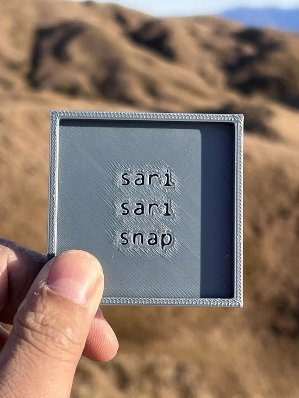
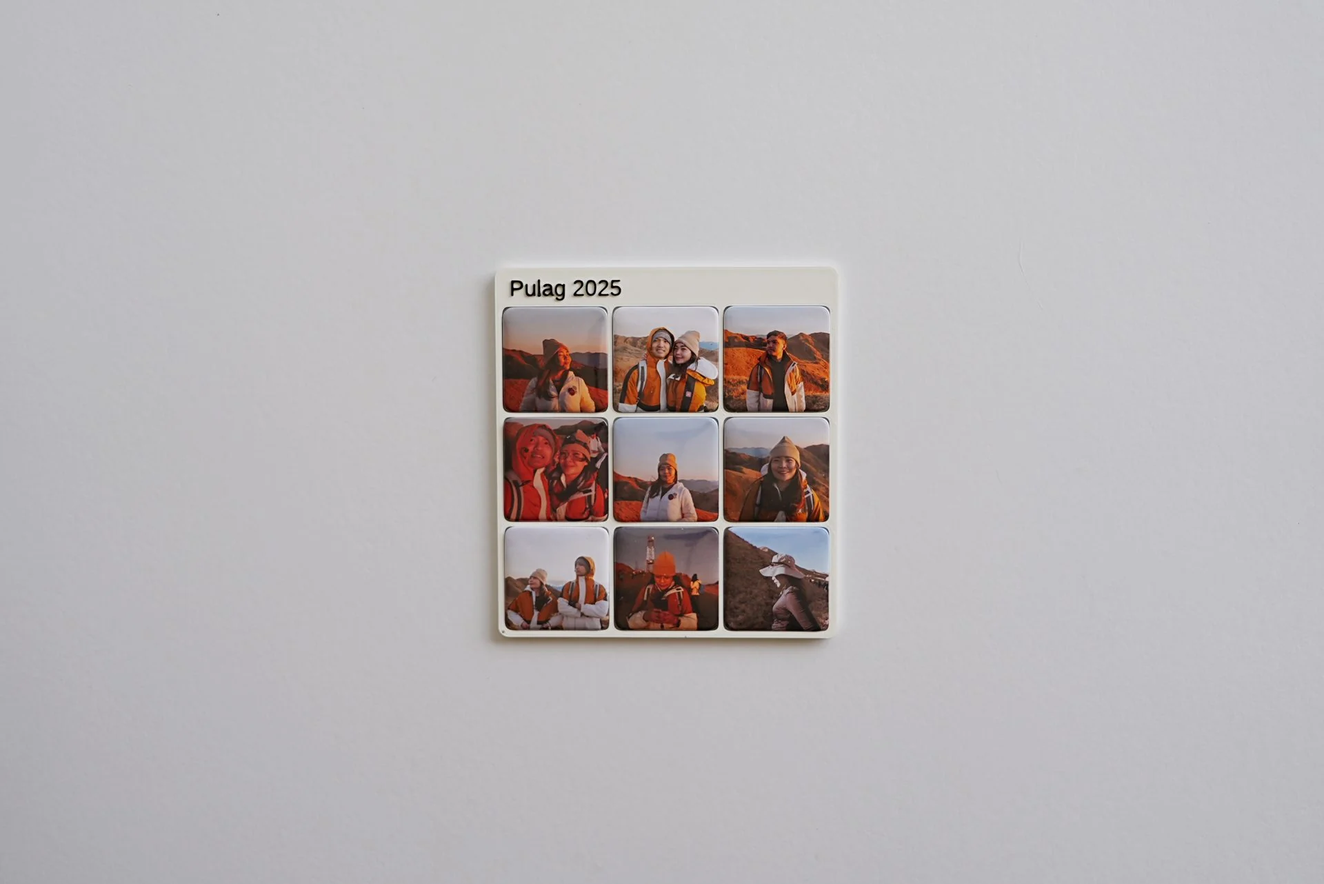
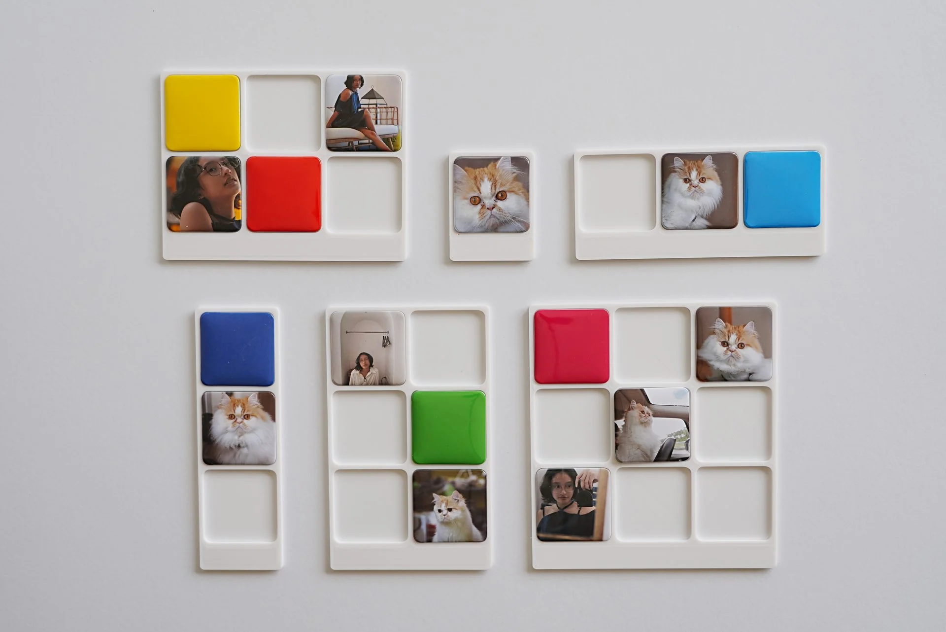
SariSari Snaps sells custom magnetic photo frames out of a home studio in the Philippines. Orders lived in Messenger threads — names misspelled, prices re-explained fifty times a week. I designed a four-step configurator and the design system behind it, so a customer could build, personalize, and confirm a keepsake in under two minutes, on their own.

My role
UX + Visual + Front-endEnd-to-end, solo
Scope
Configurator flow+ the "Lucy" design system
Platform
Mobile-first webGCash checkout
Timeline
Concept → shipped~5 weeks
01 · The situation

A micro-business drowning in its own success.

"The Celebrant" ran SariSari Snaps the way a lot of Filipino home businesses run: entirely through Facebook Messenger. A customer would send a photo, ask the price, get talked through the options, send four more photos, change their mind on the colour, and — somewhere in that thread — the engraving text would get lost. Every order was a manual conversation, and the busier the shop got, the more orders slipped.

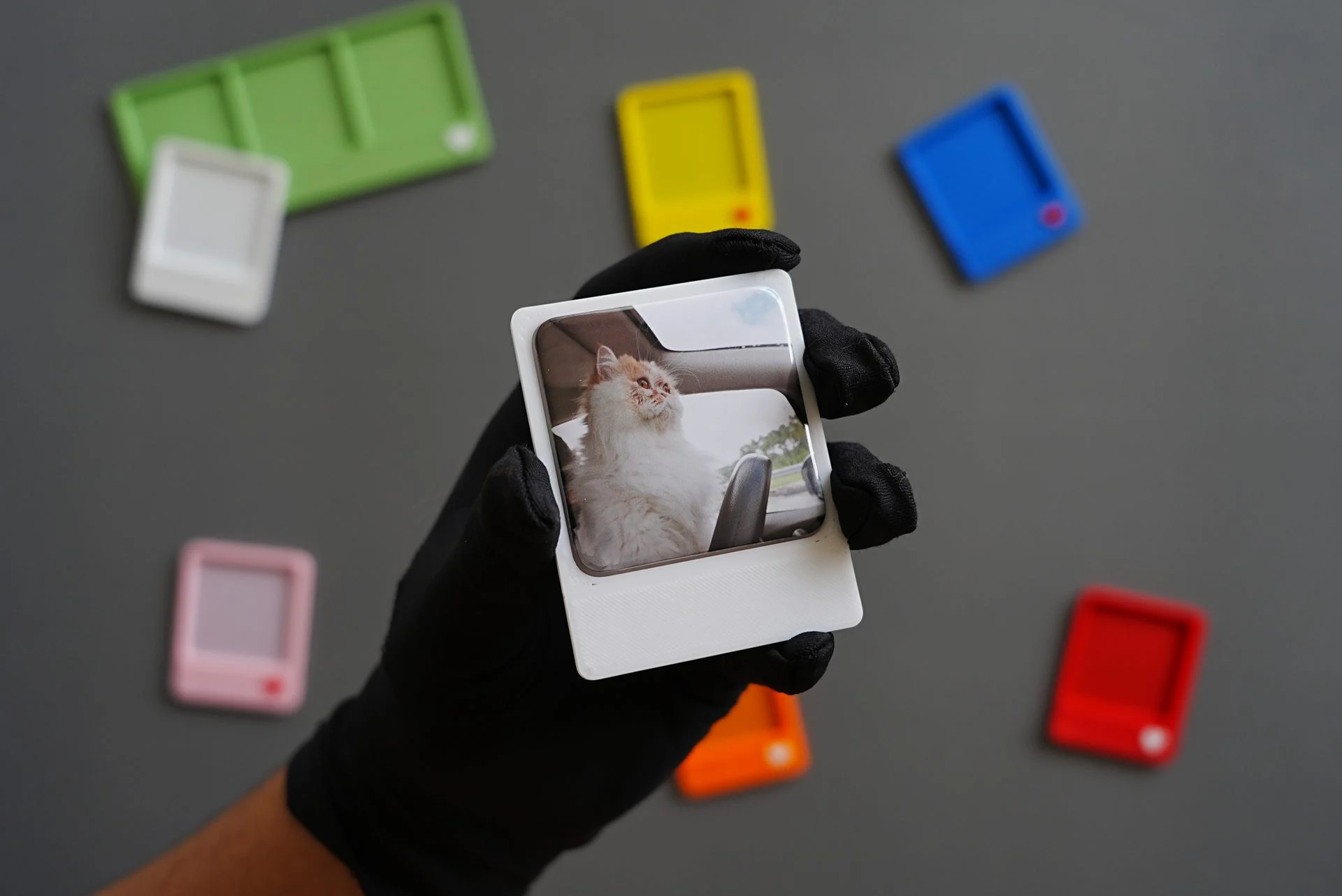
The product itself is lovely: a matte magnetic frame that holds four photos, personalized with a name or short message, engraved free. The problem was never demand. It was that the ordering experience didn't match the care of the product — and it didn't scale past the owner's own thumbs.

Friction 01
No price clarity
"How much?" was the most-sent message. Pricing lived in the owner's head, re-typed all day.
Friction 02
Lost details
Engraving text, colour, and photo order arrived across a dozen messages. Mistakes shipped.
Friction 03
Owner as bottleneck
Nothing moved unless she was online to answer. Orders capped at how fast one person could reply.
02 · The insight

The interface should be loud. The product should be quiet.

The instinct with a fun, giftable product is to make everything colourful. But the frame sits against someone's actual photos — a wedding, a baby, a barkada trip. If the product colours are saturated, they fight the photo. If the interface is timid, the brand feels generic and the "add to cart" moment never lands.

So I split the colour into two collections that never mix: a baddie interface, and a quiet product.
The constraint that answered everything else

This one decision resolved almost every downstream question. The UI could be as expressive as the brand wanted — magenta selection, honey CTAs, a lime promo chip — because none of it ever touches the rendered frame. The five frame colours stayed deliberately matte, tuned to flatter a photo rather than shout over it. Each interface accent is a frame colour at the same hue with the chroma cranked up — so the two systems feel related without ever clashing.

Lucy — the interface palette
Amplified. UI chrome only: selection, CTAs, promos, feedback. Never rendered on the product.
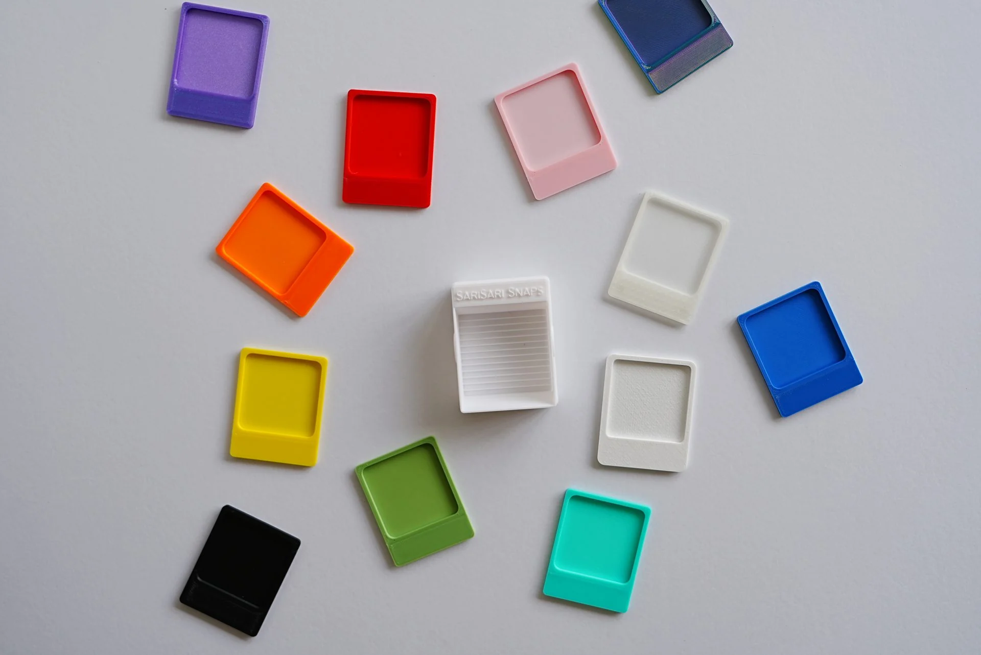
The 5 frame colours — matte
What the customer buys. Muted on purpose, so the photo always wins. Colour never changes the price.

Locked law: frame colours stay matte, permanently. Writing the rule down kept later additions from drifting the two collections back together.

03 · The principles

Four rules that made every other decision easy.

01
Two collections, never blended
Interface colour and product colour are separate systems with separate jobs. The UI can be as loud as the brand; the frame stays calm.
02
Three fonts, three locked jobs
The display face is emotional only (headlines, giftable copy). The sans carries every functional pixel — including prices and buttons. Mono is reserved for tiny system tags. No exceptions, so nothing ever feels off-brand by accident.
03
One selection colour
Selection Magenta means "this is chosen / this is focused" everywhere — swatches, form focus, SKU tiles, steps. One consistent signal so the customer always knows what they've picked.
04
Warmth is a feature, not decoration
The voice is Taglish, direct, a little funny — even in the error states. A payment failure should feel like a friend catching a typo, not a system scolding you.
04 · The flow

Four steps, no dead ends.

The whole Messenger conversation compresses into a locked four-step path. Each step does exactly one job, shows progress, and lets you go back without losing anything. Personalization — the thing that used to get lost in the thread — gets its own dedicated step, with live character limits so nothing ships too long to fit.

1
Choose frame
Pick the SKU. Price is visible up front — the question that used to fill the inbox is answered before it's asked.
2
Pick colour
Five matte options on a live preview. Colour has zero price impact, stated plainly, so there's no hesitation.
3
Add your text
Free engraving with per-column limits and instant validation. The detail that used to get lost is now structured.
4
Review order
One clear summary, then GCash. The owner receives a complete, correct order instead of a puzzle to assemble.
01 Configurator · step 3, personalization
(mobile-first)
05 · Inside the system

Small decisions that carry the brand.

The button that stamps. The primary CTA is Honey fill on Ink text — a 9.5:1 contrast ratio, so it's both the loudest thing on screen and fully accessible. Its signature is a hard 6px offset shadow with no blur: Ink at rest, Selection Magenta on hover, and on press the offset collapses to zero so the button physically stamps down like a rubber stamp. A tiny piece of tactility that makes committing to an order feel good.

Naming the field "Your text." "Inscription" and "Engraving" tested as intimidating — they made people feel they needed something profound. "Your text" gave permission to be casual, and casual is exactly the tone that gets orders finished. The label is a UX decision, not a copy afterthought.

Voice, all the way into the errors. Most design systems let the brand voice evaporate at the system messages. Here it's the opposite — the errors are where the warmth matters most, because that's where people feel stupid.

Payment failed
Error: Transaction declined (code 402).
Payment didn't go through. Your card was declined — no charge was made. Give it another try, or use GCash instead.
Text too long
Invalid input: exceeds maximum length.
Max 10 characters per column — try something shorter.
Info
Notice: orders after 15:00 process next business day.
Heads up po: orders placed after 3PM ship the next working day.
Saved
Draft saved successfully.
Saved. Your photos and text are locked in — you can still edit before checkout.

Struck-through line = the default system message. Below it, the one that shipped.

06 · The outcome

The inbox stopped being the storefront.

The configurator turned a one-person, always-on operation into something that runs while the owner sleeps. Orders now arrive complete and correct — the frame, colour, engraving, and quantity already assembled — so the studio spends its time making, not decoding threads.

4→1
Multi-message thread → one self-serve flow
0
Pricing questions in the inboxThe answer is on the page now
24/7
Orders accepted without the owner online

Directional outcomes framed from the design goals of a personal project, not audited business metrics.

07 · Reflection

The lesson I keep from this one is that a single, well-named constraint does more than a hundred pretty screens. "Loud interface, quiet product" wasn't a visual flourish — it was a rule that answered colour, contrast, typography, and even copy questions before they came up. When the constraint is right, the design system almost writes itself, and everyone building on it stays in tune.

If I took it further, I'd add a photo-upload preview inside step three so customers see their actual images in the frame before checkout, and I'd instrument the flow to see exactly where — if anywhere — people still hesitate.

Made to keep.
SariSari Snaps · brand line