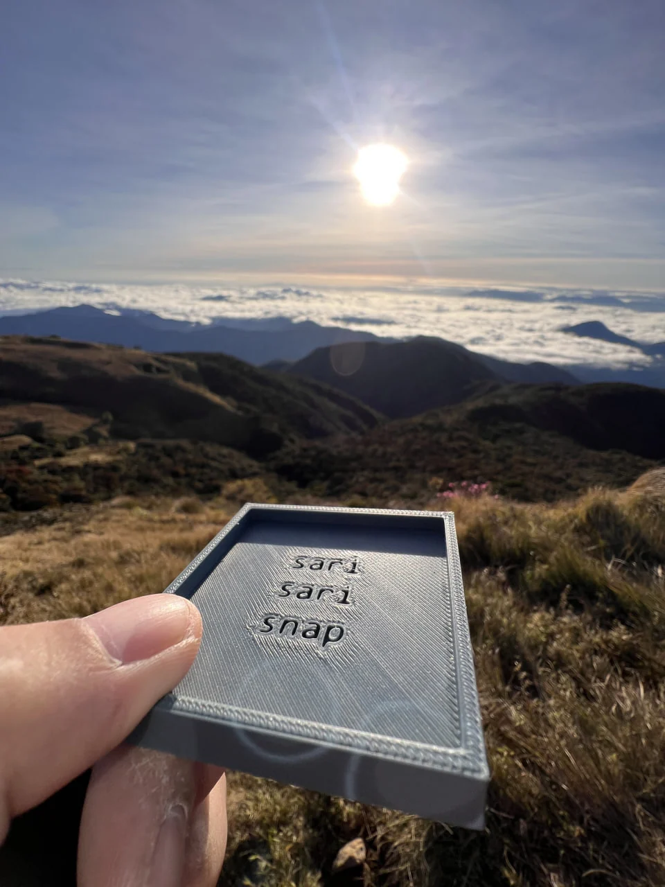
The first prototype contained almost everything the system would remove.
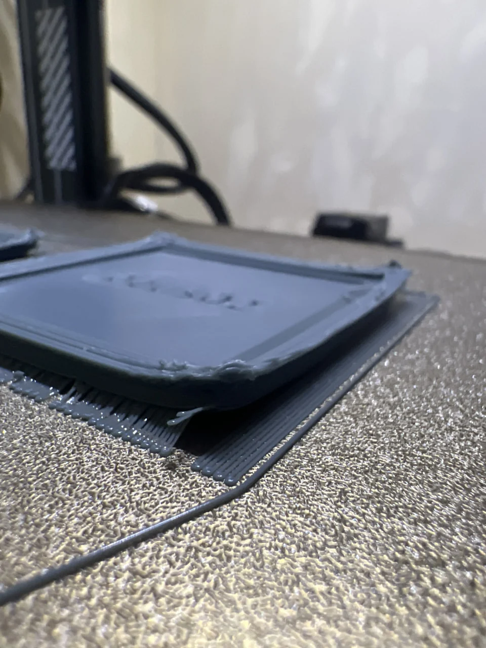
It was rough, hollow, centrally branded, and wrapped in a decorative border. Before it could hold a photograph, the frame was already demanding attention.
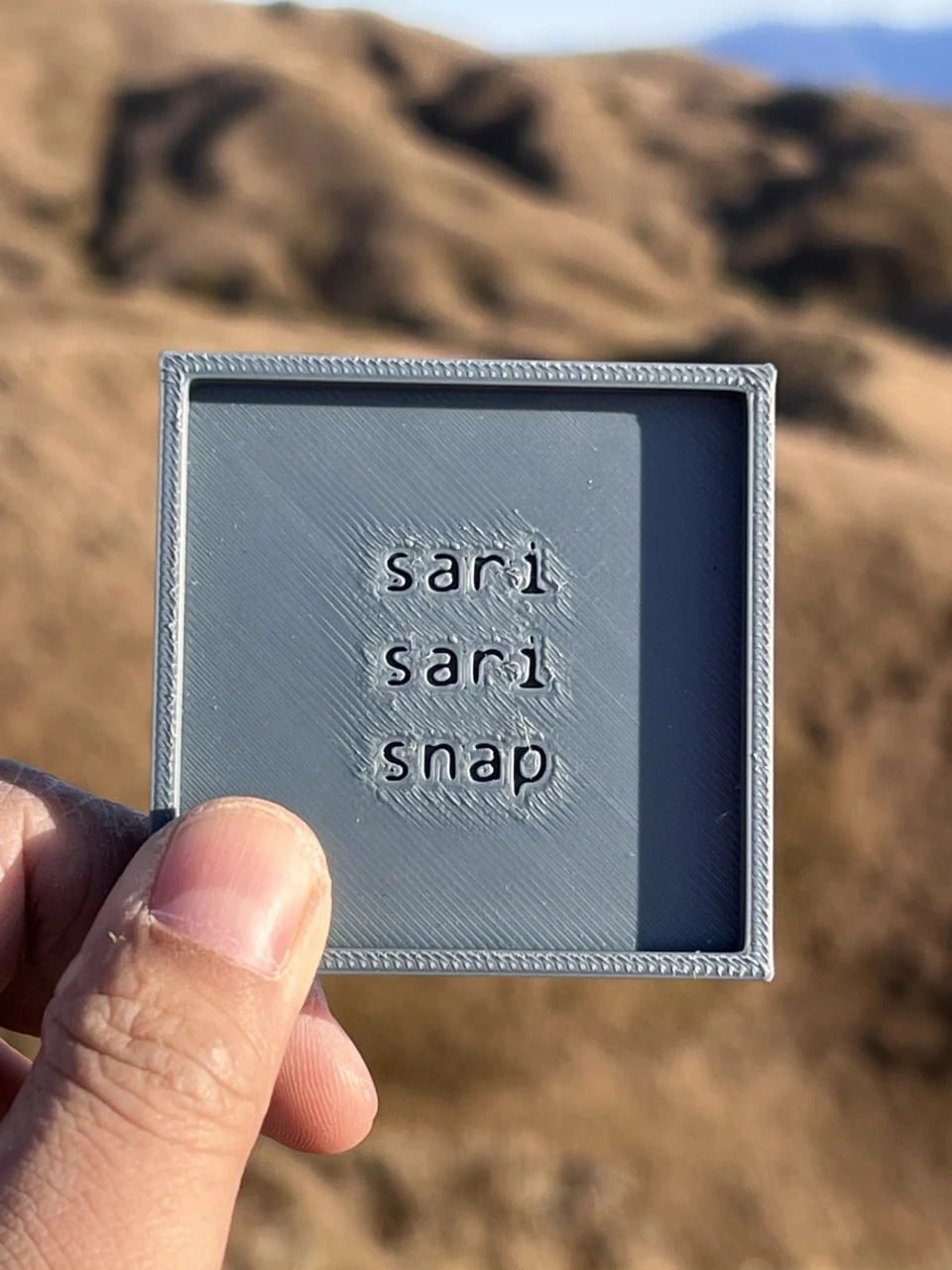
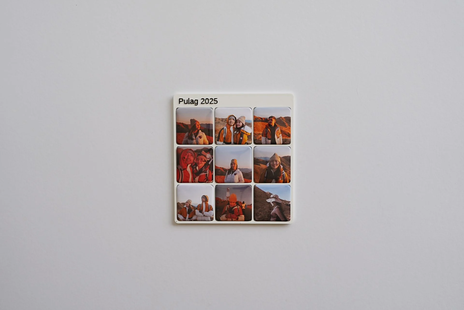
The prototype went to Pulag as a toy for the gods. The joke gave the project life; the work that followed gave it rules.
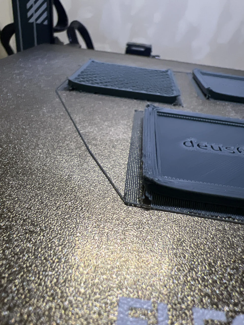
The printer turned clean geometry into a physical argument.
Renders concealed the exact point where a design failed. The print bed exposed it: lifted corners, rough first layers, excess filament, and damaged edges—each weakness at full scale.
I stopped drawing products and built a rule.
One fixed square pocket became the module. Columns, rows, and orientation could change; spacing, edge conditions, and the lower personalisation zone stayed governed by one OpenSCAD model.
What stays fixed
- Solo
- Double Take
- Triple Treat
- Wide Shot
- Classic
- Six Pack
- Eight Tiles
- Gridstagram
- Darling Dozen
Nine formats hold between one and twelve photographs. Their orientation and scale change; the underlying rule does not.
The frame was not the subject.
The moment a real photograph entered the prototype, the hierarchy became obvious. The object needed no stronger identity—only a precise pocket, a reliable grip, a quiet boundary, and a small place for meaning beyond the image.
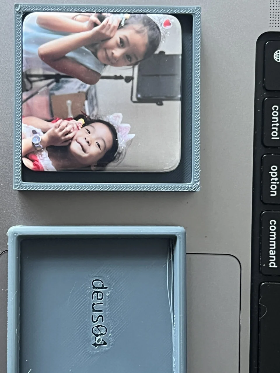
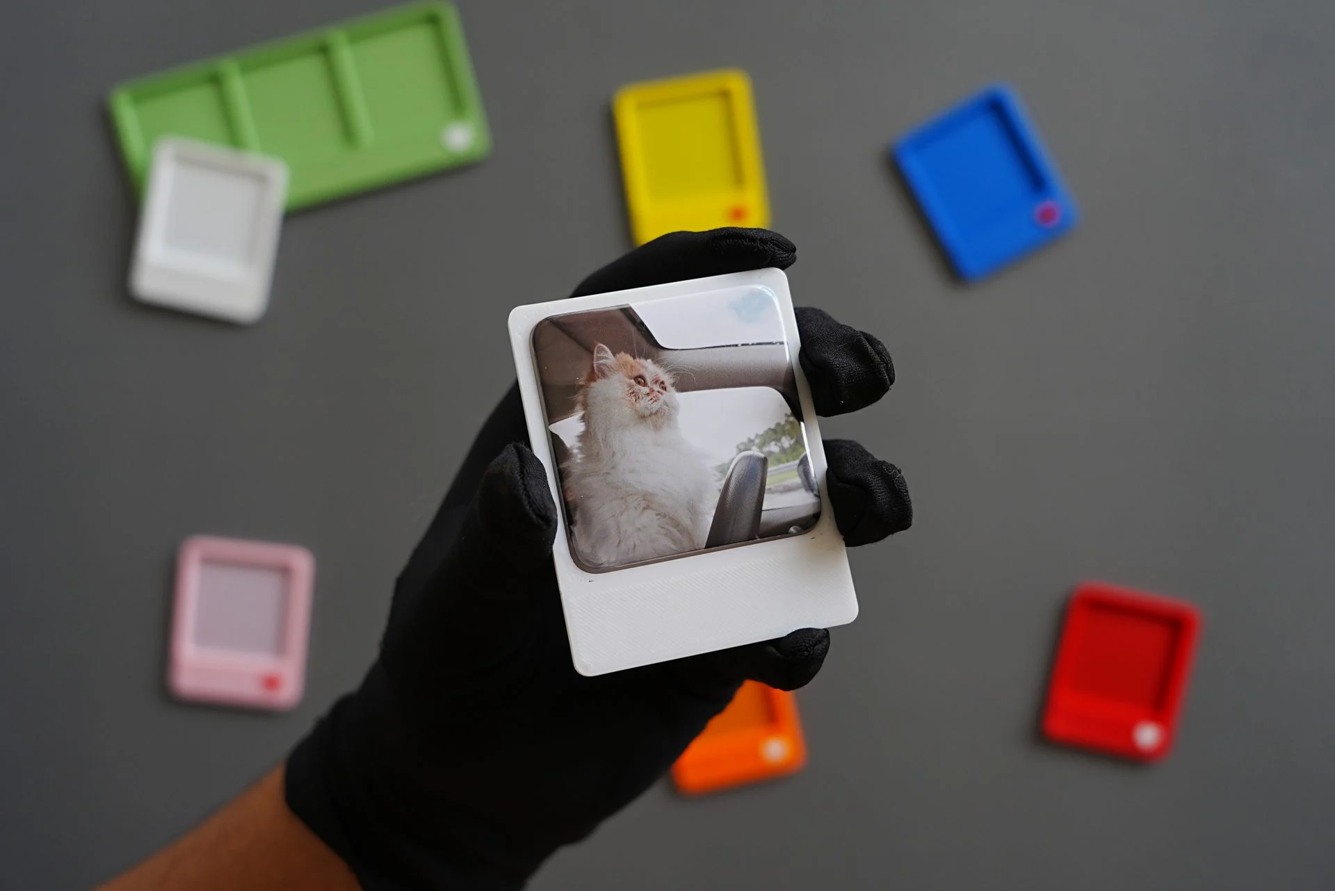
Hold the photograph precisely.Let everything else recede.
The rule behind every later decision
Colour stayed only when the photograph came first.
The early palette was broad, saturated, and often glossy. Real images exposed what swatches could not: yellow dirtied pale areas, saturated edges pulled attention from faces, and gloss threw highlights across the print.
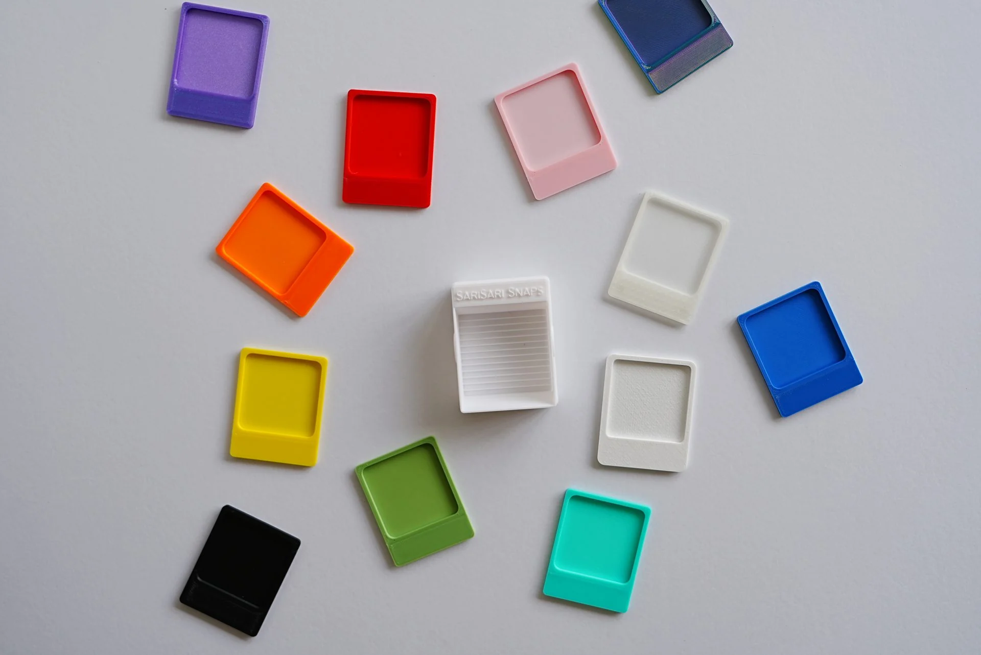
Five matte colours survived: White, Black, Sage, Blush, and Dusty Blue. Garcia chose the final five; what I brought was the condition they had to survive — photograph first, or the colour goes.
Personalisation earned a boundary.
Text stays on one line below the photograph grid. Its available length follows the frame width and orientation. A small stamp can share the same centre line; neither is allowed to compete with the images.
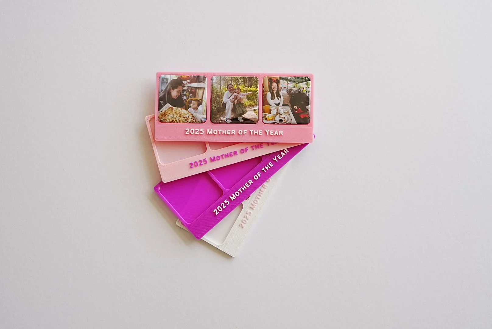
One rule held across all nine formats.
The final test was consistency at scale: from Solo to Darling Dozen, more photographs, new orientations, and a larger footprint without inventing a new object each time.
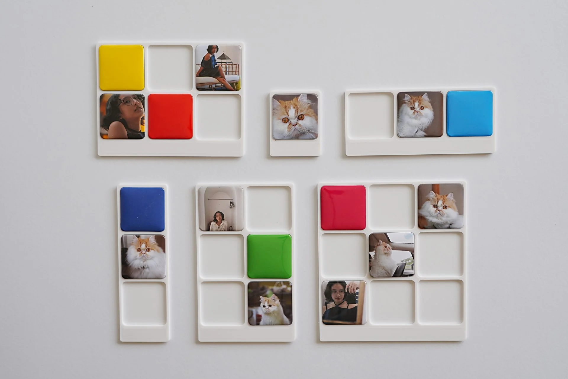
The object settled. What had to agree with it next was the storefront — part two is the configurator that sells these frames, and it derives its preview from the same millimetres.
The system improved by subtraction: fewer colours, fewer arbitrary dimensions, fewer decorative gestures, clearer limits. The result is a frame present enough to hold the photograph and quiet enough to let the memory arrive first.